Project Overview
Services Provided:
- Graphic Design
- Package Design
Logo Design


The initial design I went for was something playful and colorful. To me it bordered too much like a design for children which isn’t what the goal was. I really wanted to have an all natural dog treat company and I wanted all aspects of the design to reflect that. The second rendition was closer but it felt too much like a real estate company and not a dog treat company. In the end I decided to simplify the design and use a cursive font with the name Daphne’s, it’s a nod to my paternal grandmother, with a small heart at the end of the name which I feel give off a very personable and works with the all natural-vibe I was going for.


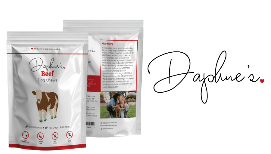
Package Design
Before I started my work on the computer I sketched out the layout for the package design. I tested a few different designs and landed on center everything starting with the logo followed by the flavor, the flavor illustration followed by informational snippets and ending with the badges at the bottom on the front panel. On the back panel I split it in a 30/70 split, on the left side I have a mini version of the front panel,followed by the ingredients, and other nutritional information. On the right hand side I have the story of the company, an image of the owners followed by socials and the website.
Once I moved to working on the computer the first thing I worked on were the flavor illustrations that I both drew and colored in Clip Studio Pro. I wanted them to have a painterly look that wasn’t too realistic. After I finished the illustrations I moved to working in Affinity Publisher for the layout of the pouches to get sizing and pouch ideas. I went to vistaprint to get examples and templates for the pouch I could create. I went with a stand up pouch with a zipper closure and used a size similar to treats I had for my dog at home. After getting the template I laid out and designed the information for one label, and looked it over to ensure it was well balanced and looked good. Once I was happy with the design I duplicated the initial layer and updated them for each flavor.
When the final design was ready. I went ahead and created the mockup for the pouches. I was going to initially use Vistaprint’s mockup but I couldn’t get it to work properly so I found an image of a blank pouch so then mapped the designs of the front and back labels. I wanted to ensure there was a visual representation of what the pouch would look like.
Social Media Posts


I know how important Social Media is nowadays not only for marketing and product reach but also trust building as well. To help with both avenues I created a few social media post templates. The one being a marketing post introducing one flavor to the audience. The other’s goal is to build trust and audience participation which is the Pup Ambassador it showcases a dog, their favorite treat and their name on a dog tag.