Project Overview
For this case study for my portfolio I wanted to showcase my skills in Graphic Design by creating a logo, packaging and social media posts for a dog treat company. I wanted to show that I know how to take the different elements starting with the logo and bring them together for a final package design.CMS: WordPress
Services Provided:
- Graphic Design
- Package Design
Logo Design


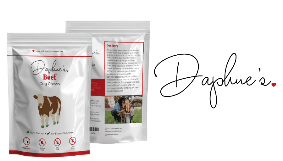
I wanted to embody a farmer’s market and homemade feel with a simple yet elegant font for the logo. I wanted the logo to look like the owner’s signature with a small heart to follow to have a “with love” feeling to it. I went through many company names and logos before I landed on this one. The first was Sunny’s Dog treats and chews with a playful sun as the logo. I wanted a playful and whimsical feel but felt like it didn’t fit the market. Then I went with Daphne’s Family Co. The logo was a house with a heart in it but it felt more like a real estate company than one for dog treats and that’s how I landed on Daphne’s.


Package Design
Before I even started doing any work on my computer for the packaging I sketch it out so I could play around with layouts and different ideas with the actual pouch. After finalizing the sketch and where I wanted to place the flavor illustration I continued finishing the drawing for the other flavors. I used references of the animals I was featuring for each flavor and first drew the outline then painted them using the reference as a guide. After all the illustrations were complete I started to work on the laying out the content in Affinity Publisher to get the finalized look for one label before duplicating it and making the remainder.
As for the package I went with a stand up pouch with a resealable zipper since the bag is intended to be reused until there are no more treats. I made sure to get a template from a printer I went with Vistaprint because I knew they’d have a variety of sizes and templates I could use for this project. I based the specs on existing dog treats I have at home and went from there. I looked at a few different brands to give me some inspiration. Based on the research I did I decided to make the front simple with the logo and flavor as the front with a few icons and key details to help customers make decisions. As for the back, I knew I wanted the layout to be split with the important ingredients and other food information on one side and the brand story on the other side. I also knew I wanted to do some color blocking to help important information stand out. I initially went with the “Our Story” section having a background and the ingredients being in a box with a stroke but felt it was a bit too much so I swapped them to give the back of the packaging better flow.
Social Media Posts


To help market the product I put together some social media posts. One to showcase a dog and their favorite treat flavor. I was thinking it could be used for testimonials and maybe even to showcase the owners or employee pets. The other is to showcase the different flavors and how they’d be your pup’s newest obsession. I wanted to keep the posts simple making sure to highlight the different bag designs as well as using the showcase how the treats will look.